
5 Ways To CSS Background Gradients Can Create Stripes Including How to Make a Barbershop Pole Effect

Last Updated -

Background stripes can be created using just CSS, without loading an image using a linear-gradient. There are all sorts of effects you can create using a css gradient background.
Not only can you make horizontal and vertical stripes you can also make interesting patterns by making the gradient repeat.
At the end of this article you will learn how to use the linear-gradient for different CSS background gradients. You will also learn how you can even make an animated barber shop pole!
The web has come such a long way since it was first introduced around 30 years ago. The demand or expectations consumers have for user experiences have evolved over that time and today we are expected to provide rich experiences.
One of those rich experiences is the use of striped backgrounds. Today CSS makes background stripes very simple to implement in any modern browser, including the deprecated Internet Explorer.
Background stripes can be made with blue, red, green, purple, yellow and any other color combination you may want. You can even create zebra 🦓 stripes!
Stripes can be horizontal, vertical or diagonal. You can also apply animations to create motion, even make your own barbershop pole 💈 effect!
The secret to making striped backgrounds in your web pages is the CSS linear-gradient and repeating-linear-gradient properties.
How the linear-gradient Function Works
The linear-gradient() CSS function creates an image composed of at least two colors. The function creates a natural transition between to the colors, hence the gradient.
There are no fixed dimensions to the gradient, it is designed to fill the entire containing element's box.
The linear-gradient method accepts a combination of parameters, the only required parameters are at least two color stops. These can be preceeded by either an angle or a position value (side or corner).
linear-gradient( [
The side-corner can be a combination of left or right and top or bottom.
The angle is a numeric value suffixed with 'deg'.
background: linear-gradient(45deg, red, blue);Color stops include a color value, which can either be named, a hex value or an rgb combination. It can also include an optional length, which is a valid CSS length unit like pixels, percent, etc.
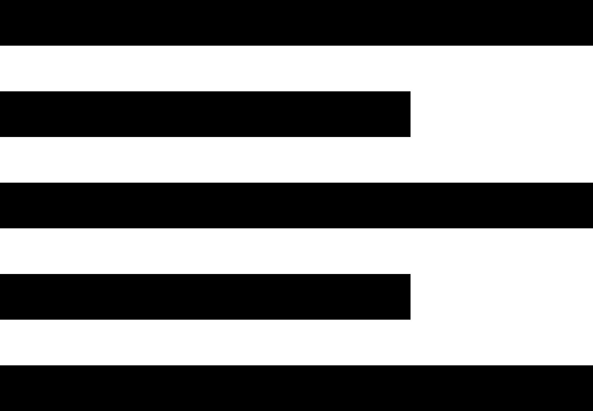
To start our learning process lets create a simple black and white horizontal stripe. This requires setting an element's background to a linear-gradient with 4 color stops.
.horizontal-stripes { border: solid 1px red; background: linear-gradient( #fff, #fff 20px, #000 20px, #000 40px); height: 200px; width: 200px; } 
The first two color stops are white, the second two are black. The white color stops create a hard gradient, 20 pixels wide. The black color stops create a second stripe, starting at 20 pixels. The second part of the black color stop pair should stop the black stipe at the 40 pixel mark, but it takes up the remaining space. Remember gradients fill in the entire container element's space.
We can modify the CSS to make a vertical stripe:
.vertical-stripes { border: solid 1px red; background: linear-gradient( 90deg, #fff, #fff 20px, #000 20px, #000 40px); height: 200px; width: 200px; } 
This requires adding an angle value of 90 degrees. You can use any angle value you want to rotate the stripes as needed.
Making the CSS Gradient Repeat to Create a Black and White Striped Background
A single gradient is a good starting point, but stipes need to repeat. This is where the repeating-linear-gradient function comes in.
.vertical-stripes { border: solid 1px red; background: repeating-linear-gradient( 90deg, #fff, #fff 20px, #000 20px, #000 40px); height: 200px; width: 200px; } 
Moving Beyond Linear Stripes to Zig Zags
So far I have shown how to make straight lines, but CSS is more powerful than that!
A Zig Zag ⚡ pattern can add some extra pizazz to your layouts. This can also be done using the linear-gradient function. The trick is to use multiple linear-gradient declarations. Each one rotated slightly differently to create the alternating pattern.
The lines created by the linear-gradients overlay a background. For this example I made the lines an off black color and the background pink.
.zig-zag { background: linear-gradient(135deg, #ECEDDC 25%, transparent 25%) -50px 0, linear-gradient(225deg, #ECEDDC 25%, transparent 25%) -50px 0, linear-gradient(315deg, #ECEDDC 25%, transparent 25%), linear-gradient(45deg, #ECEDDC 25%, transparent 25%); background-size: 100px 100px; background-color: #EC173A; } 
Animating a Striped Background to Imply Motion or Activity
A common application of background stripes is to provide a visual indication of process progress, such as a loader. You can use the stripe techniques I demonstrated earlier, combined with a simple key-frame animation.
Now you can create an animated stripe effect to make the appearance of progress.
In this example I have made multiple progress bars of different colors. A blue, green, red, yellow and purple striped background.
@keyframes loader { 0% { background-position: 1rem 0; } 100% { background-position: 0 0; } } 
The loader animation changes the background postion from 1rem horizontal to a 0 position. This makes the stripes move from right to left.
The background-position property designates where the background is physically positioned relative to the background's origin. In this example I am using values for the x and y position to move the background horizontally.
The animation repeats every second.
Making a Barbershop Pole Effect
A loader is sort of too web page specific. This time lets make a classic barbershop pole!
This effect uses a multi-colored linear gradient of red, white and blue tilted 25 degrees. The stripes appear to corckscrew down the pole.
.barbershop-pole { width: 64px; height: 100%; margin: 0 auto; background-color: #fff; background-repeat: repeat-y; background-size: 100% 88px; background-position: 0% 0%; background-image: repeating-linear-gradient(-25deg, #fff, #fff 20px, #df5646 20px, #df5646 40px, #fff 40px, #fff 60px, #1c78a4 60px, #1c78a4 80px); animation: barberpole 4s linear infinite; } 
The animation causes the background to move or appear to move from the pole's top to the bottom. Adjusting the percents, shown as 50% here, causes the animation to accelerate. You can adjust this as you like to make the effect look like you want.
@keyframes barberpole { 0% { background-position: 0% 0%; } 100% { background-position: 0% 50%; } } To add a rounded effect you need to apply styles to the pole's :before element. In this example the psuedo element is layered above the pole and semi-transparent borders are created. These borders give a slight grey color to the pole's side, giving it a little depth.
.barbershop-pole:before { content: ''; display: block; box-sizing: border-box; width: 100%; height: 100%; z-index: 12; border-right-style: solid; border-left-style: solid; border-right-width: 10px; border-right-color: rgba(120, 120, 120, 0.1); border-left-width: 14px; border-left-color: rgba(60, 60, 60, 0.1); } How cool!
Summary
Hopefully you can see just how useful linear gradients can be to make your web pages a richer experience without bloating the page's payload.
There are so many nice effects you can do today with just CSS that in the past were either impossible or required complex image manipulations that cause the page to not only load slowly, but not work well across different device viewports.
These examples should help you get started with some nice layout effects to enhance your pages.
You can access my source code examples on GitHub.