Touch Friendly Design'Making Touchable Targets
The way we design application clients has radically changed in the past couple of years with the proliferation of SmartPhone and tablets with touch screens. Touch is the newest common user input methodology. Sadly it seems to be broadly ignored by the developer majority. By this I want to call attention to the way we design modern web and native mobile applications, which tends to retain aspects common to legacy web sites.
In particular the use of anchor <A/> tags and other small action points that are not difficult to reach with a mouse. Now that I have tablets and smartphones in my life I spend more time consuming content (i.e. reading) on my iPad than I do on my laptop. Instead of moving a mouse cursor around the screen I am directly touching the navigational target or content I want to interact with. As smartphones and tablets gain a larger and larger market share this is becoming more common across all aspects of computer usage. But it seems developers are still stuck on legacy techniques that make touch interactions frustrating in many cases.
One of the most common scenarios I have encountered is the display of a traditional desktop, mouse-friendly web site. Why is this a bad thing? Traditional navigation uses hyperlinks, which are typically limited to just the text. Another thing that often does not translate so well to a touch device is drop-down menus.
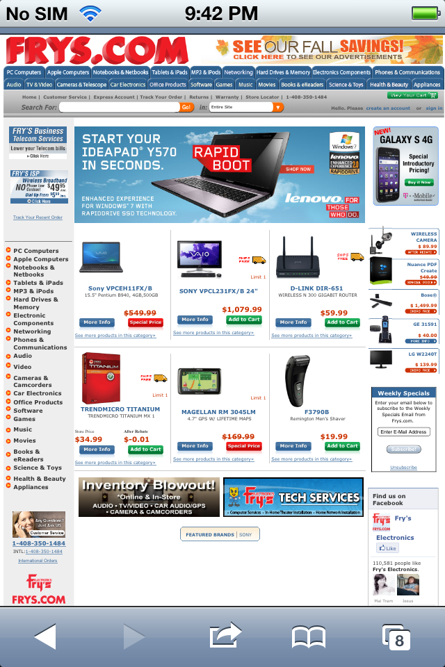
I was near a Fry's last week (thanks Desert Code Camp!) and wanted to see if they had a new battery for my laptop. Bringing up the frys.com site on a phone loads the desktop site, a bad thing in and of itself. But they desktop site, even if this was a tablet is difficult to navigate because the navigational targets are too small and too close.

Frys.com Homepage on the iPhone ' Think How Hard It is to Touch Navigate
Why are hyperlinks a bad thing, how else are you going to traverse through a web site? Well by nature they are not touch friendly. Unless you make explicit efforts to control the dimensions, padding and margins of a hyperlink the size of a hyperlink touch target is limited to the text wrapped by the <A/>.
If you read the Apple Human Experience Guidelines you see a recommendation of at least a 44x44 pixel square for a touch target.
Give tappable elements in your application a target area of about 44 x 44 points.
-Apple User Experience Guidelines
The Microsoft touch point recommendation is for a 9mm square. The reason they recommend 9mm is after conducting a large set of user testing. They found that users make fewer mistakes when targets are bigger and the 9mm target offers the best set of balance between hit rate success and layout flexibility.

As a side note, I find it interesting that Apple chose to recommend a size in pixels, where Microsoft chose millimeters. While 44 pixels is much easier to the average web developer to understand, millimeters is probably more useful. Screen sizes and pixel densities vary across devices (and monitors for that matter). So fixing a touch target with pixels may not necessarily mean it is a good touch target when pixel densities increase. Desktop monitors, phones and tablets are all increasing pixel densities to give us a richer and richer visual experience. So choosing pixels as your unit of measure may not hold up in the long run.
Over the past few months I have been using a simple demo to illustrate the issues with traditional touch targets compared to modern, touch-first targets. I built this example after spending the summer making a high percentage of mistakes navigating around web sites on my Nook Color, iPad and Motorol Xoom tablets. The Nook offered the worst experiences as most web sites do not detect it as a tablet or touch device, and it has the smallest screen real-estate. Since it was the first touch device I had the levels of frustration with traditional navigation were high.
In this example there are two menus that represent what a typical web site might look like. On the top you see a traditional horizontal navigation using hyperlinks, wrapping text. When the user clicks the hyperlink with the mouse they are taken away to the target page. Notice how the click targets as relatively small with minimal spacing between them. While this works with a mouse, human fingers are going to generate a lot of missed targets.
Below the mouse friendly menu is a more touch friendly version. Instead of using hyperlinks as the action item the entire <LI> element is actionable by binding a click event handler. Each menu item is now at least a 90px by 36px rectangle. There is also a margin of 12 pixels between each menu item. When a user touches the menu item with their thumb or index finger they should have a very high probability of touching the desired menu option.
Compare the Best Buy mobile experience to the Fry's experience. While there is no where near as many navigational options it is effective, especially to a phone user. Everything on the page is 'touchable'.

The problem of not following a touch-first design approach is not limited to web sites and web apps it seems to proliferate through native mobile apps as well. I download and try many native apps and see tiny touch targets all the time. This includes controls such as radio buttons and checkboxes. The traditional indirect mouse friendly interfaces we have used the past 2 decades are rapidly degrading as we enter the world of direct, touch first client devices. As developers and front-end designers we must keep this in mind. Failure to do so most likely means the failure of your business.


